Branding


Alka Boutique
Client: Alka Boutique
Project: Branding/Creative
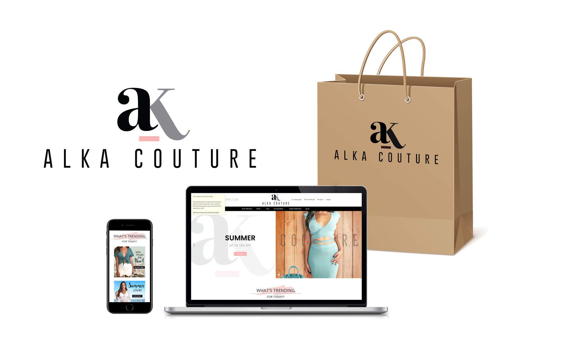
Alka Boutique contacted AfterImage Creative to re-brand and create a new look for their upscale boutique. The client's request was to create a different identity from its competitors and portray the brand as upscale and modern, incorporating the re-branding into its brick and mortar location as well as online.
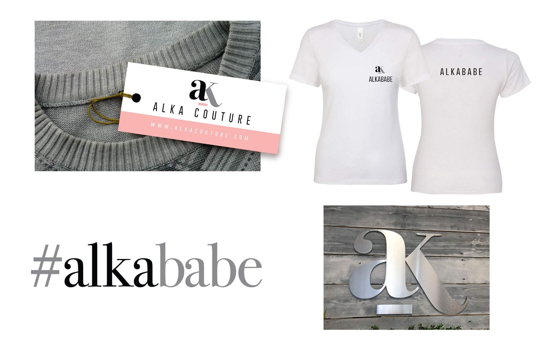
THE RESULT: AfterImage Creative loved this challenge and developed a combination of a symbol, color presence and industry buzzwords that were carried across logo/store branding/hang tag/online/shopping bags/employee apparel. The initials "ak" were established as an icon that would build brand presence and identity. The color blush pink was implemented to add softness to the minimalistic logo. The hashtags #alkababe and #alkatrending were created to build online presence.


Leyva Gymnastics Academy
Client: Leyva Gymnastics Academy
Project: Branding/Creative
Client approached AfterImage, Inc to develop a brand identity for Leyva Gymnastics Academy, home to 3 time Gymnastics Olympic Medalist, Danell Leyva. Their request was to deliver a look that catered to both female and male aspiring gymnasts. They also stipulated staying away from the typical gymnastics colors or red and blue combined.
THE RESULT: After much research and discovery, AfterImage Creative proposed a logo that incorporated not only a female and male gymnast, but the male is a silhouette of Danell Leyva. Brand colors used are unisex and can be applied to various color environments. The entire brand and unified vision incorporates the use of Danell Leyva delivering a clean, modern approach.

Men's Health Clinics
Client: Men's Health Clinics
Project: Branding/Creative
Dealing with a sensitive issue, the challenge for Men's Health Clinics was to cater to their male audience and cleverly establish what their product and services were.
AfterImage, Inc conceptualized and developed a campaign that included print and online, utilizing a "masculine" cool scheme, while being specific and address the challenges of their demographic.


Right Choice Adult Care
Client: Right Choice Adult Care and Activity Center
Project: Branding/Creative
Right Choice Adult Care and Activity Center's focus is to be the adult day care in northern Florida that is not the typical adult day care center, but one where patients are treated like they're family. The client approached AfterImage, Inc to brainstorm a name and logo for the company and carry the new branding into other aspects of their marketing collateral. Two main requirements were to be met - use warm and non-medical colors, and an illustrated (non-photographic) image of happy seniors.
THE RESULTS: The brand logo is a mixture of compassion and strength - there's strength in the color green, but softness in the other colors and the script font used. The senior couple portray a lively, yet inviting quality and the brand message and tagline encompass the client's vision.The logo and its personality were established in all of the the stationery components, marketing collateral, outdoor signage, vehicles, website and social media.
